Things I'm Proud of

Portfolio

Websites & designs that I'm proud of. Some are made as frontend dev at Reprovinci, other things for my own clients as Art & Flywork which involved both design & development.


My work is for a large part full-stack development with a focus on frontend. Working on sites I'm always trying to build up the team by evaluating and evolving workflows and making consistent components a hub between designers and developers.

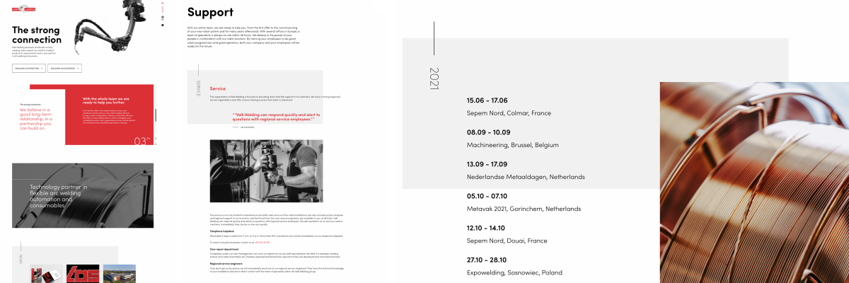
Valkwelding

@reprovinci / tags: kirby-cms,full stack development

Proud of the team! The design team made a beautiful design to work with. Slick layouts and typography. We built an easy manageable cms setup with Kirby and connected the components to the editable blocks in the cms. Some well timed transitions assist in reading each section with renewed focus.

Fairclimatefund

@reprovinci / tags: kirby-cms,full stack development,toolbox components,2018

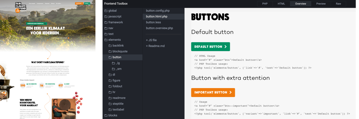
At Reprovinci we made the design and website for Fairclimatefund. This is one of the earlier sites where I worked from a "toolbox setup". A well structured and visual representation of all components . A bit like storybook but with php templates. Components consisted of a folder containing a template + controller, styling file, optional javascript file and preferably a readme. Components where bundled in groups based loosely on the atomic design system. We had elements, blocks and sections. And build the site with these components.

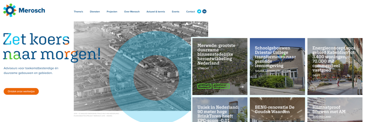
Merosch

@reprovinci / tags: full stack development,kirby-cms,toolbox components,2020

Consultants for future-proof and sustainable buildings and areas.

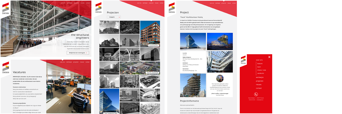
Swinn.nl

@reprovinci / tags: full stack development,kirby-cms,2019

Swinn.nl is a bold website for a construction company in Gouda. We worked out a characteristic and bold design for their new website. I did frontend development.

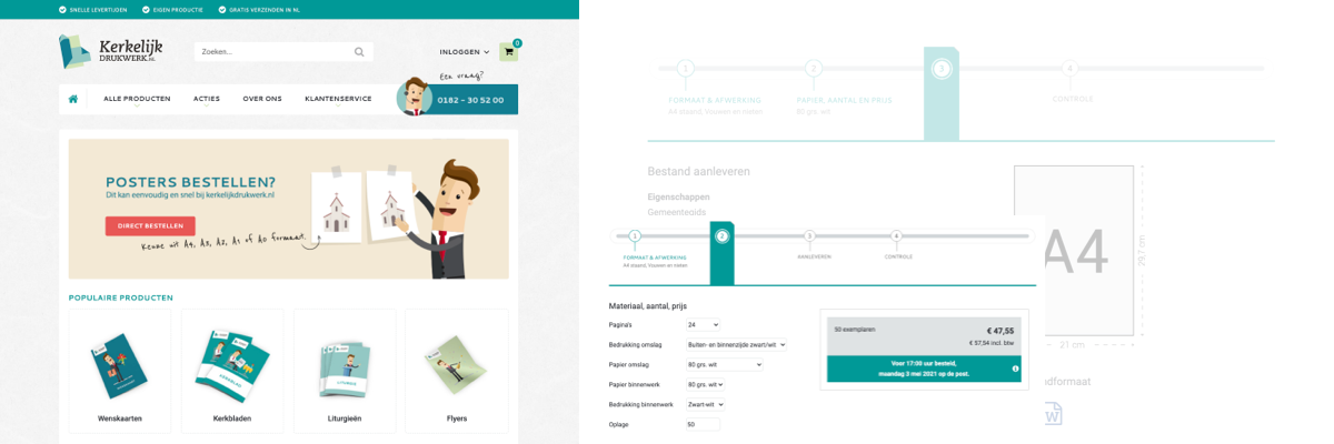
Kerkelijk Drukwerk

@reprovinci / tags: webshop,frontend

Kerkelijk Drukwerk & the twin-site goprint.nl are frontends for the printshop at Reprovinci.

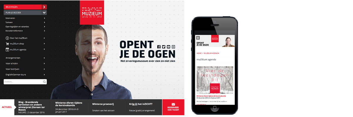
Muzieum

@reprovinci / tags: full stack development,kirby-cms

Muzieum is a museum that let's you experience the world as if you were blind. At Reprovinci we've set them up with a totally new identity and campaign. I've worked on the front-end of the website and had a lot of fun doing so. I really like the homepage for the surprising interaction.

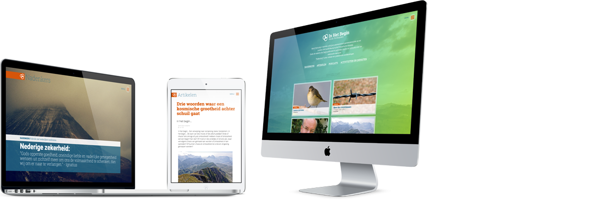
In Het Begin

@artandflywork / tags: concept,design,development,kirby-cms

For Henk Rothuizen – a former preacher, church leader and currently inspiring writer & speaker – I created a platform for sharing knowledge and inspiring articles as well as offering services. 'Nadenkers' are weekly short incentive articles that form the core of the site. Articles are the longer and more in-depth readings and a large archive of sermons.

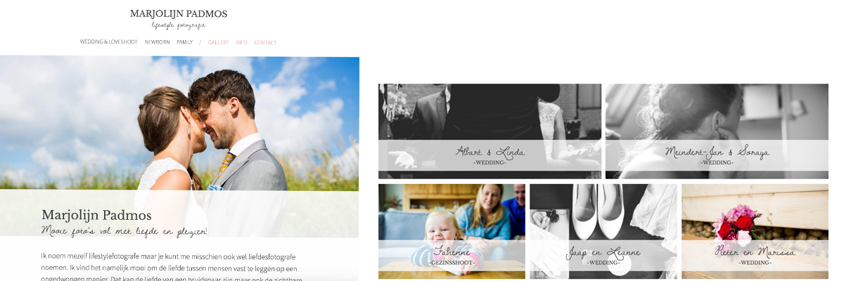
Marjolijn Padmos Fotografie

@artandflywork / tags: design,development,kirby-cms

Marjolijn Padmos is a lovely and talented photographer for wedding & familie shoots. She had specific wishes for her website and together we worked out a website that was both easy manageable and met her wishes.

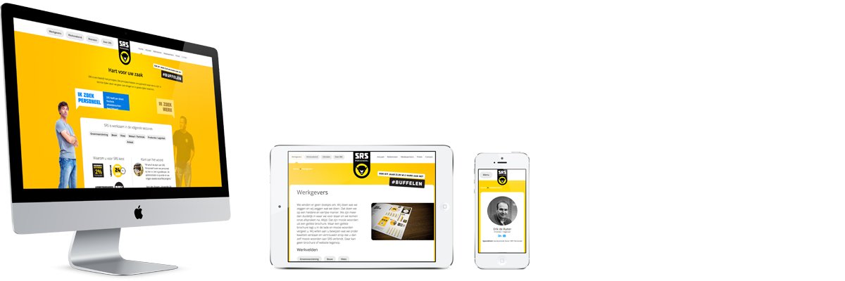
SRS Personeel

@reprovinci / tags: full stack development,kirby-cms

A yellow website. Yellow is so underrated. I love yellow :-)
This site is a bit older. Some tweaking has been done to it, not all as fancy as I wished, but the site still is one of my favourites. I love the mobile menu animation. It tells how the web should work: It should flow and push to make space, top down and LTR or RTL (depending on our localisation).